


The Federal Reserve just raised its benchmark interest rate by 25 basis points, lifting the target range to 3.75%-4.00%.
Though widely expected, that decision still made the headlines. The quieter signal sat inside a chart traders call the “dot plot.”
These dots told the market the Fed isn’t quite done tightening, so the U.S. dollar moved within minutes of the release.
Let’s break down why a page of dots can shove currency markets around.
What Is the Dot Plot?
The dot plot is part of the Fed’s quarterly Summary of Economic Projections (SEP). Four times a year, each participant on the Federal Open Market Committee (FOMC) writes down where they personally think the federal funds rate should land at the end of each of the next several years.
Every projection becomes one dot on a chart. Stack the dots for a given year, and you get a scatter plot showing where the group leans.
The September Fed meeting covered 19 participants and projections running through 2029, plus a “longer run” estimate for where rates settle once the economy normalizes.
Focus on the median, the middle value once every dot is sorted from lowest to highest. That’s the number headlines quote, and the one that moves markets.
One thing worth noting is that the dot plot is not a promise. Each dot reflects one official’s personal forecast, not a vote and not a commitment. These estimates can shift as new data arrives, and Fed Chair Kevin Warsh has said more than once that the Committee isn’t locking itself into a path.
Why Did the Dots Move This Time?
Line up September’s dots against June’s and the shift jumps out. Per the Fed’s Summary of Economic Projections, the median federal funds rate projection for 2026 rose to 4.1%, up from 3.8% in June. The 2027 median climbed to 4.1% from 3.6%.
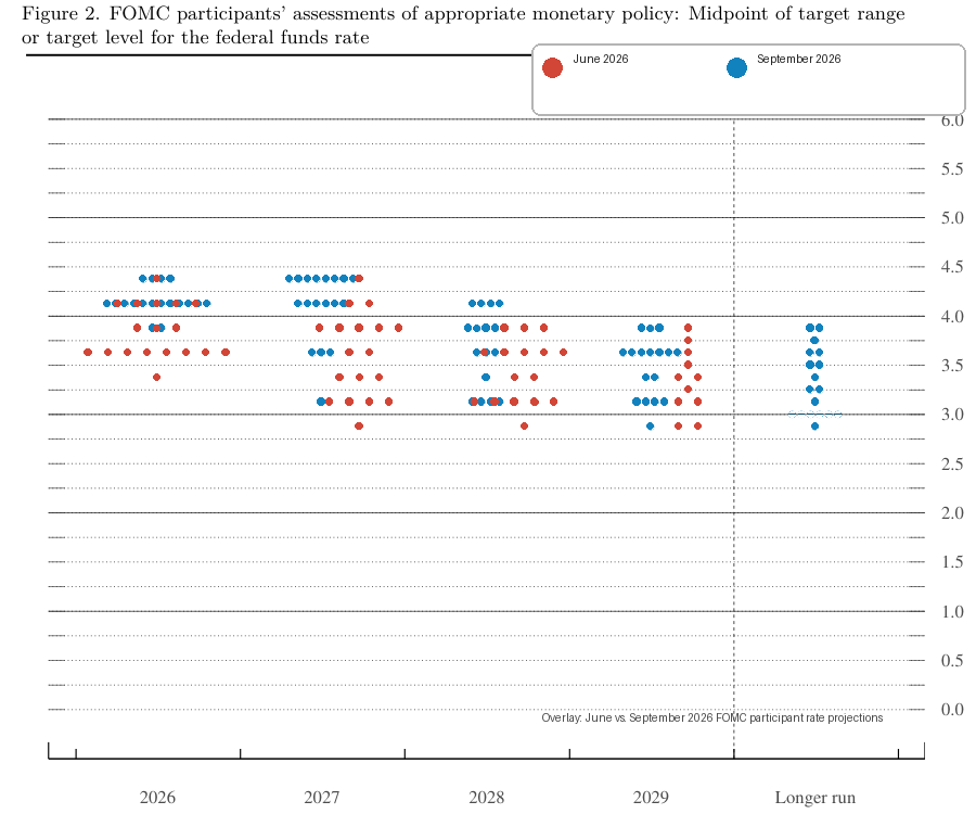
Every year through the forecast horizon moved up by roughly 0.3 percentage points. This suggests that the typical FOMC participant now expects at least one more quarter-point hike before the year closes out.
A few data points likely fed into that shift. U.S. retail sales for August 2026 jumped 6.0% year-over-year, well above the 4.7% forecast economists had penciled in. Import prices ran hot too, up 7.0% year-over-year against a 6.4% forecast. Together, those numbers point to consumer demand and imported cost pressure that haven’t cooled the way the Fed would like.
The Fed’s own updated forecasts back up that read. The median projection for headline PCE inflation, the Fed’s preferred inflation gauge, rose to 3.7% for 2026, up from June’s 3.6%. Core PCE inflation, which strips out food and energy, climbed to 3.4% from 3.3%. Both sit well above the Fed’s 2% target.
Geopolitics probably played a role, too. The Fed’s statement pointed to inflation that has stayed elevated for too long, against a backdrop that includes an ongoing conflict in the Middle East keeping energy costs high across several economies.
Still, none of this guarantees the Fed will hike. Warsh stopped short of committing to anything specific at his press conference.
Promoted: Keep Your Automated Edge Running 24/7.
Your algorithmic strategy shouldn’t rely on your home Wi-Fi. In high-volatility events, execution speed and uptime are what separate a winning backtest from a live market success. ForexVPS provides ultra-low latency, dedicated trading servers that keep your algos executing trades around the clock without interruption. Stop letting connectivity issues erode your edge.
Explore VPS plans at ForexVPS!
Disclosure: To help support our free daily content, we may earn a commission from our partners if you sign up through our links, at no extra cost to you.
What Does the Dot Plot Mean for the Market?
Markets tend to read a higher dot plot as hawkish, and the reaction on September 16 showed how that plays out for currency pairs and risk assets.
The Dollar Index (DXY), which tracks the Greenback against a basket of major currencies, jumped from around 99.7 before the announcement to roughly 100.3 by the close.
USD/JPY pushed up to about 156.10. USD/CHF and USD/GBP each firmed by roughly 0.7%. The euro and Australian dollar both lost ground against the dollar in the same window.
A higher expected path for U.S. rates tends to widen the gap between U.S. yields and yields available elsewhere. Wider yield gaps often draw capital looking for better returns, and that flow can support the currency offering the higher rate. That’s one reason hawkish dot plots tend to line up with dollar strength.
Do note that the relationship isn’t automatic, though. Currency markets move on surprise relative to what traders had already priced in. The raw level of any single projection matters less.
USD/CAD offered a useful contrast that day. It rose the least among the major dollar pairs, even as oil fell roughly 3% to near $102 a barrel. Positioning and other cross-currents likely pulled on the pair too, not the rate story alone.Zoom out, and a higher rate path can ripple into markets that feed back into forex. It may cool risk appetite in stocks (the S&P 500 fell about 0.5% that session) and dent the appeal of gold, an asset that pays no yield of its own, as bullion slid roughly 0.6% in the aftermath.
The Bottom Line
- The dot plot is a scatter chart of individual Fed officials’ rate forecasts, published four times a year inside the Summary of Economic Projections. Treat it as a snapshot of opinion, not a binding schedule.
- Compare the new dots against the prior release. The direction of the shift, higher, lower, or flat, usually carries more weight than the raw number itself.
- A hawkish move, like September 2026’s shift higher, has historically lined up with dollar strength. Data surprises, positioning, and decisions from other central banks all still shape the size of any given reaction.
- Interest rate differentials are one input among many. Oil prices, growth data, and geopolitical developments can pull a currency pair in a different direction than the rate story alone would suggest.
- New traders may want to track two separate signals inside the same chart: the median shows the group’s central view, while how tightly the dots cluster shows how much disagreement sits underneath that view.
This article breaks down how the Fed’s dot plot shifted hawkish in September, but you may not be familiar with how to read where a central bank sits on the policy spectrum in the first place. Premium members can read our lesson:
📖 Hawkish vs. Dovish: How to Read Central Bank Language
Reading this helps you understand what makes a rate decision hawkish or dovish, how to spot where the Fed sits on that spectrum before the headline number even lands, and why the tone behind the dots often moves the dollar more than the rate hike itself.
And if you’re not a Premium subscriber yet, now’s a good time to sign up.
With Babypips Premium, you get full access to School of Pipsology lessons that help you understand not just what the dollar did after the dot plot dropped, but the policy language and positioning shifts driving the move.