


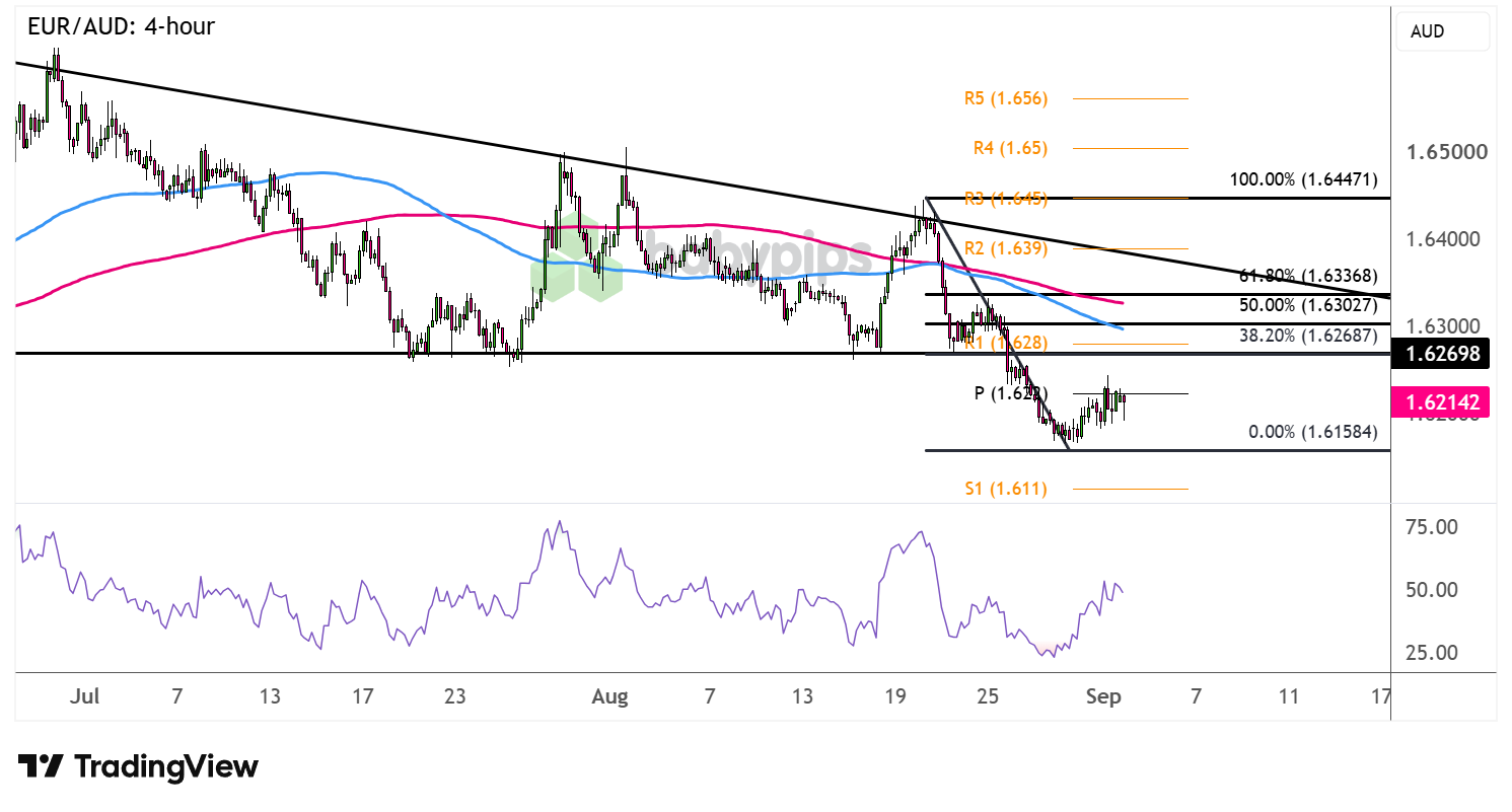
EUR/AUD recently fell through its triangle bottom to suggest that a downtrend is in the cards.
Are more sellers ready to join on a pullback? Or is this merely a correction from the triangle breakdown?
Check out these retracement levels on the 4-hour time frame.
EUR/AUD: 4-hour
EUR/AUD 4-hour Forex Chart Faster with TradingView
Risk rallies and upbeat Australian data recently boosted the Aussie against most of its forex peers, though Warsh’s hawkish Jackson Hole speech appears to have pared gains.
Add to that a fresh round of geopolitical tensions, and the higher-yielding commodity currency appears to be losing steam on its climb.
The pair has pulled up to the pivot point (1.6220) that seems to be the first layer of resistance on this pullback, though a larger correction could still test the Fibonacci levels.Remember that directional biases and volatility conditions in market price are typically driven by fundamentals. If you haven’t yet done your fundie homework on the euro and the Australian dollar, then it’s time to check out the economic calendar and stay updated on daily fundamental news!
The 38.2% retracement lines up with the broken descending triangle bottom and R1 (1.6280), while the 50% Fib coincides with the 100 SMA dynamic resistance. The 61.8% level is right around the 200 SMA, which could be the line in the sand for a bearish correction.
Look out for reversal candlesticks at any of these levels, as a return in selling pressure could drag EUR/AUD back down to the swing low near the 1.6150 minor psychological mark or to the next downside target at S1 (1.6110).
Whichever bias you end up trading, don’t forget to practice proper risk management and stay aware of top-tier catalysts that could influence overall market sentiment!
This EUR/AUD setup is built around a resistance zone where a broken triangle bottom, a Fibonacci retracement, and a pivot support level all converge at once. Premium members can read our lesson:
📖 Confluence: Stacking the Odds in Your Favor
Reading this helps you understand why multiple technical factors aligning at the same level create a stronger signal than any one factor alone, what makes a stacked support zone more significant than a single line on a chart, and how to evaluate setup quality before committing to a direction.
And if you’re not a Premium subscriber yet, now’s a good time to sign up.
With Babypips Premium, you get full access to School of Pipsology lessons that help you understand not just where resistance sits on a chart, but why a zone where multiple factors overlap carries more analytical weight than any single level on its own.